

Why I avoided the “professional” font on my website
I saw Playfair Display in the backend of my website and immediately knew it was wrong.
Serif fonts work differently in context. What looks elegant in a carousel you scroll past becomes exhausting on a website you're supposed to navigate. The cognitive load compounds with sustained use.
As a woman with ADHD in midlife, I felt that difference viscerally. My brain was screaming, “This is too much,” while my conditioning argued, “but this looks more credible.”
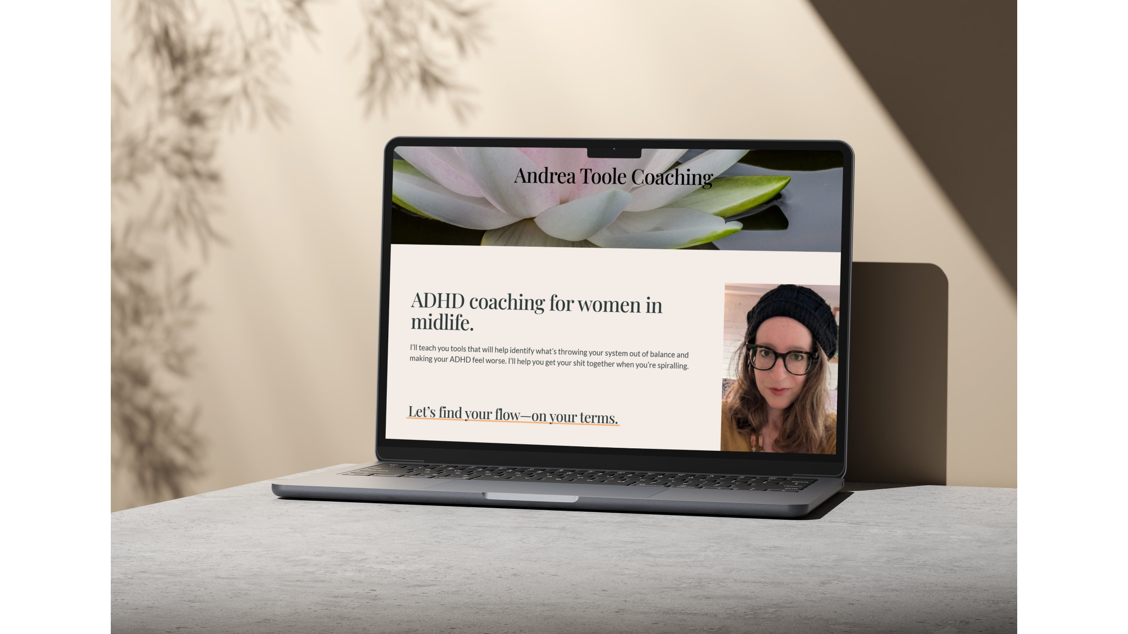
I switched to sans serif because it doesn't make my brain work harder than necessary.
And if serif fonts aggravate my sensory issues, they're doing the same to my audience—high-functioning women with ADHD navigating complex professional lives.
Most marketers miss this gap: the difference between what photographs well and what actually serves your audience in context. Between borrowed credibility markers (serif = professional) and authentic accessibility.
Context matters
A serif font in a static Instagram carousel hits differently than that same font on your website. In a carousel, you're looking at an image for a few seconds. On a website, you're navigating, reading, trying to find information while managing multiple tabs and tasks.
The decorative elements that create visual interest in a static image become noise when you're trying to read body text. Those serifs that signal 'traditional' and 'established' also signal increased visual processing for ADHD brains already managing executive dysfunction.
This is why testing design decisions in the actual format matters. What works in one context fails in another.
Design signals values
Your design choices tell your audience who you built this for.
When I choose sans serif for my website, I'm saying: I've thought about your brain, not just my brand aesthetic. I've prioritized how you experience this content over how it photographs for my portfolio.
Traditional 'professional' markers—serif fonts, formal layouts, corporate colour palettes—weren't designed for neurodivergent brains. They were designed to signal credibility to neurotypical decision-makers in specific industries.
But if your audience is neurodivergent, those markers can actively work against you. They create barriers rather than build trust.
Accessibility isn't optional
(I’m doing my best.)
Accessibility isn't just alt text and colour contrast ratios. It's typography. It's white space. It's cognitive load.
Sans serif fonts are easier to read for many neurodivergent people—those with ADHD, autism, dyslexia, and visual processing differences. They reduce visual noise. They let content be the focus rather than fighting decorative letterforms.
This doesn't mean serif fonts are bad. It means they serve different purposes. Use them intentionally, not reflexively. And test them in the actual context where your audience will experience them.
If your website makes someone's brain work harder to process basic information, you've created friction before they've even engaged with your content.
Listen to your own brain
My immediate reaction to Playfair Display on my website was information. My brain said 'this is wrong' before my conditioning could argue.
If you're building content for neurodivergent audiences and you share those brain differences, trust your gut reactions to design decisions. Your sensory responses are data about how your audience will experience your work.
This doesn't mean every design choice is universal. But it does mean your lived experience is valuable information about accessibility.
I ditched the serif font because it failed the most important test: would this make it easier or harder for my audience to engage with this content? Everything else is secondary.
What to do with this
If you're building content, platforms, or marketing materials for neurodivergent audiences:
Test your design decisions in the actual format your audience will use. A font that works in a PDF might fail on a website. A layout that looks clean in a mockup might create chaos in practice.
Consider cognitive load at every decision point. Does this design element serve the content, or does it create extra processing work?
Question 'professional' defaults. Who decided serif fonts were more credible? What assumptions are baked into that standard? Do those assumptions serve your actual audience?
If you share neurodivergent traits with your audience, pay attention to your own reactions. Your brain is giving you feedback about accessibility.
Accessibility and professionalism aren't in conflict. But we need to redefine what 'professional' actually means. It's not about borrowed aesthetic markers. It's about whether your audience can actually engage with what you've built.
I choose sans serif because it removes barriers. That's the most professional choice I can make.